If your walls still carry that cold grey from a few years back, 2026 is shaping up to be the year it finally looks dated. The big shift in interior paint trends 2026 is towards rooms that feel warmer, calmer and easier to live in day to day – not just colours that look good in a display home for five minutes.
That matters if you are painting a family home, freshening up a rental, or updating a commercial space that needs to look polished without feeling sterile. Trends come and go, but repainting takes time, money and proper preparation, so the smart move is choosing colours and finishes that look current now and still hold up well in a few years.
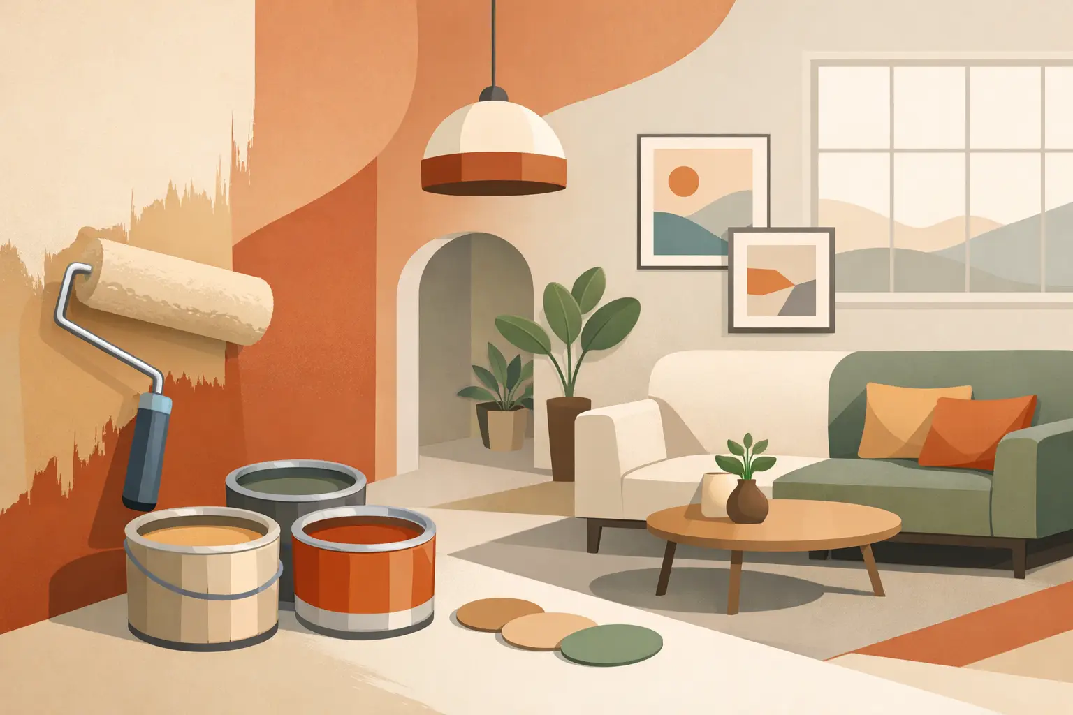
What interior paint trends 2026 are really pointing to
The strongest trend is not one single colour. It is a move away from sharp contrast and overly cool interiors, and towards softer, more grounded spaces. People still want a clean finish, but they also want warmth, depth and practicality.
In real terms, that means crisp white everywhere is no longer the default answer. Cooler greys are losing ground. In their place, we are seeing warm whites, clay-based neutrals, muted greens, richer earth tones and feature colours used with more restraint. The overall look is more settled and more lived-in, without feeling dark or heavy.
For Adelaide properties, this makes sense. Strong light can flatten some colours and make cold tones feel even harsher. A shade that seems subtle on a paint card can look completely different once it is up on a broad wall with afternoon sun hitting it. That is why trends need to be filtered through the reality of your home, your lighting and how the room is actually used.
Warm neutrals are replacing flat greys
Warm neutrals are leading the way because they do the hard work of making a room feel fresh without feeling clinical. Think soft off-whites, creamy stone, beige with a little depth, sandy taupe and light mushroom tones.
These colours suit open-plan living areas especially well. They bounce light around, hide minor wear better than brilliant white, and work with timber floors, natural fibres, black fixtures and brushed metal finishes. They also make decorating easier. If you change furniture, window coverings or flooring later, warm neutrals are less likely to fight with those updates.
That said, not every beige works. Some can turn yellow, pink or muddy depending on the light. The trick is testing them properly on the wall, in more than one spot, and looking at them across the day. A good professional painter will tell you straight if a colour is likely to shift in a way you will regret.
Green is staying strong, but getting softer
If one colour family has earned its place, it is green. In interior paint trends 2026, the greens getting attention are less dramatic than the deep bottle tones that had their moment. The move now is towards muted olive, sage, eucalyptus and dusty green-grey shades.
These colours work because they add character without dominating a room. In bedrooms, they bring a quiet, settled feel. In living spaces, they pair well with timber, stone and warm white trims. In offices or commercial interiors, softer greens can feel more professional and less severe than charcoal or navy.
Green is also useful where you want a feature without creating a hard contrast. A full room in the right muted green can feel more cohesive than one bold feature wall surrounded by plain white. It depends on ceiling height, natural light and how much visual break the room already has.
Earthy colours are moving in
Terracotta, soft rust, clay, caramel and cinnamon-based tones are showing up more often, especially in accent areas. Not every home needs a whole lounge room in burnt earth tones, but these colours are finding their place in studies, dining rooms, powder rooms and joinery.
Used properly, they add warmth and a sense of finish. Used badly, they can date quickly. That is the trade-off.
The safest approach is to use earthy tones where they support the room rather than take it over. Cabinetry, niches, a single wall in the right space, or paired elements like a hallway and adjoining study can work well. If the room already has red undertones in brick, flooring or furniture, the paint selection needs extra care so it does not all start competing.
Deep blues and charcoals are becoming more selective
Dark colours are not disappearing, but they are being used with more purpose. In 2026, navy, inky blue and charcoal still have a place, just not as a default sign of sophistication.
These shades work best where the architecture supports them. A media room, a formal dining room, a reception area or bespoke cabinetry can carry a deeper colour nicely. In a small room with poor light and a low ceiling, the same paint can feel heavy fast.
There is also a maintenance angle. Dark walls show dust, scuffs and patching more easily. They usually need better preparation and a more careful application to get a clean, even finish. If the surface is rough, damaged or previously patched, that work needs to be sorted before the first coat goes on. No shortcuts.
Finishes matter just as much as colour
One of the less flashy but more important interior paint trends 2026 is the move towards practical finishes. People are paying more attention to how paint performs, not just how it looks on day one.
Low-sheen and washable finishes are popular because they strike a good balance. They give walls a soft, modern look without showing every mark the way a dead-flat finish can in busy homes. In rentals, hallways, kids’ rooms and commercial interiors, durability matters. A beautiful colour is not much use if it starts looking tired after a few months of normal wear.
Ceilings are still generally best kept flatter to reduce glare and hide minor imperfections, while trims, doors and cabinetry often benefit from a slightly higher sheen for easier cleaning and sharper definition. The right finish depends on traffic, moisture, wall condition and how much natural light the room gets.
The all-white look is changing, not disappearing
White is still a mainstay, but the all-white interior is shifting. Instead of stark white walls, ceilings, trims and doors all matching exactly, there is more layering going on.
A warmer white on the walls with a cleaner trim colour can create definition without looking busy. Soft tonal variation across walls, woodwork and cabinetry gives a room more depth. It still reads as clean and bright, but it does not feel flat.
This is particularly useful in newer homes where everything can otherwise blend into one pale surface. A bit of considered contrast helps architectural details stand out and gives the paintwork a more finished, higher-end feel.
How to choose a trend that will still work in two years
Following interior paint trends 2026 does not mean copying what you saw online and hoping for the best. The better approach is to take the direction of the trend and apply it to your property properly.
Start with the fixed elements you cannot easily change – flooring, tiles, benchtops, cabinetry, brickwork and natural light. Then think about how the room gets used. A rental property needs colours that appeal broadly and stand up to wear. A family home may need more forgiving finishes in high-traffic areas. A commercial space might need to look current, but still align with the business image.
This is where practical advice matters more than trend talk. A colour can be fashionable and still wrong for the room. Likewise, a classic shade chosen well can feel more modern than a bold trend colour applied in the wrong place.
At Shine Painters Adelaide, that is usually the conversation worth having first – what will look right, wear well and suit the property, not just what is currently popular on a paint chart.
Trend-led painting only works if the preparation is right
It is easy to focus on colour and forget the surface underneath. But if walls are cracked, patchy, stained or poorly sanded, even the best paint choice will not look right.
That is especially true with the softer, more natural palette coming through in 2026. Warm neutrals and muted tones can show surface inconsistency if the preparation has been rushed. Darker feature colours can highlight roller marks, flashing and patch repairs. Good painting is not just about picking the right shade. It is about getting the walls properly ready, using the right products, and applying them cleanly.
If you are planning a repaint this year, it is worth thinking beyond what is trending this month. Choose colours that suit your light, your layout and how you live or work in the space. Get the prep right, use finishes that can handle real use, and aim for a result that still feels solid once the trend cycle moves on. That is usually the difference between a paint job that looks fresh for a season and one you are still happy with years later.