
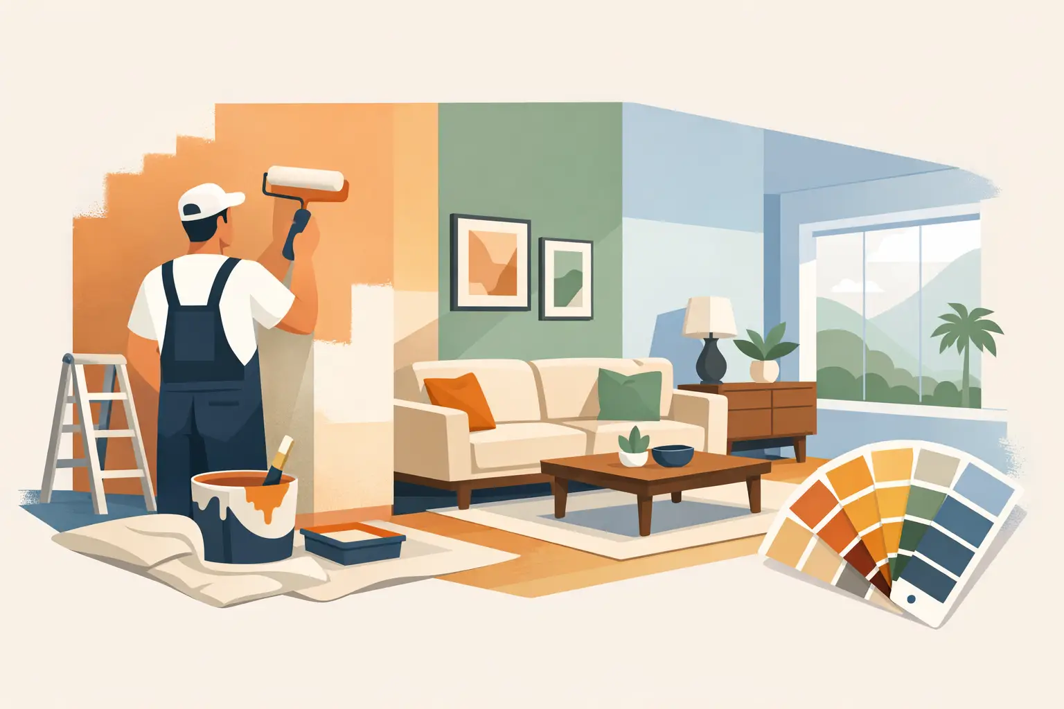
A freshly painted room can make an older Adelaide home feel properly cared for, but the best interior house painting ideas are not just about picking a colour from a small sample card. Light, wall condition, room use and the existing finishes all affect whether the final result feels calm and polished or simply looks like a quick cover-up.
A good paint job starts with a clear purpose. You might be making a family home brighter, preparing a rental between tenants, updating a dated kitchen, or giving a commercial reception area a cleaner first impression. The colour matters, but so does the preparation underneath it. Cracks, scuffs, old patching and uneven surfaces are far more obvious once new paint goes on.
Start with the room, not the colour chart
Before choosing paint, consider how the room is used and how much natural light it gets. North-facing rooms in Adelaide often handle cooler or deeper colours well because they receive warmer, consistent daylight. South-facing rooms can feel cooler and benefit from warmer whites, soft beiges or gentle greige tones that stop the space feeling flat.
A busy hallway, children’s bedroom or rental living area needs a practical finish that can cope with marks and regular cleaning. A formal lounge may suit a softer, more layered colour scheme. There is no single best shade for every house. A crisp white that looks excellent in a bright contemporary extension can look stark in an older bungalow with warmer timber floors and cream tiles.
Test sample colours on more than one wall, then look at them in the morning, afternoon and at night with the lights on. Paint is affected by everything around it, including flooring, curtains, cabinetry and even the amount of greenery outside the window.
Use warm neutrals for a reliable whole-home update
Warm neutral colours remain one of the most dependable interior house painting ideas because they suit a wide range of properties and make future decorating easier. Soft whites, sandy beige, light mushroom and muted greige can freshen a home without turning it into a blank box.
For homeowners, these colours create a clean base for artwork, rugs and furniture. For landlords and agents, they can help a rental look tidy, bright and easy for incoming tenants to personalise. The key is to avoid choosing a white based on the label alone. Many whites carry subtle yellow, grey, green, pink or blue undertones that become noticeable across a full wall.
A practical approach is to choose one main wall colour and use a related white for ceilings, trims and doors. This gives the home a connected look while still creating enough contrast to define the architectural details.
Don’t automatically paint every surface bright white
White ceilings are usually a sound choice because they lift a room and reflect light. Walls and trims are different. Pure, bright white walls can show every mark and may feel harsh under cool LED lighting. In older homes, a warmer off-white often gives a more settled finish.
Likewise, painting walls, skirting boards, doors and ceilings exactly the same white can work in a very modern space, but it can also make details disappear. A small difference in depth between wall and trim colours often looks more intentional and is easier to maintain over time.
Add depth with a feature wall or painted detail
A feature wall is still effective when it has a reason for being there. The wall behind a bed, a fireplace wall, a dining nook or the back of a study can carry a deeper colour without making the entire room feel closed in. Olive, dusty blue, charcoal, terracotta and deep green can all work well, depending on the home’s light and fittings.
The trade-off is that dark colours show imperfections more readily than pale shades, particularly on broad walls with side lighting from windows. They also need careful cutting-in and even coverage. If the wall has dents, failed old repairs or a rough texture, repair work should happen before the first coat goes on.
For a less committed option, consider painting a recessed nook, half wall, internal door or shelving backing. These smaller details add character while keeping the main room light. A painted arch around a study desk or reading corner can work too, although it needs accurate layout and clean lines to avoid looking temporary.
Make small rooms feel considered, not merely bigger
Light colours can help a compact room feel more open, but painting everything white is not the only answer. A small bedroom, powder room or study can look excellent in a mid-tone colour when the ceiling, trims and walls are coordinated. This approach creates a cosy, finished look rather than drawing attention to every edge of the room.
Vertical colour can also help. Painting a darker shade below a dado line and a lighter colour above it can ground a hallway or dining room. In a room with a low ceiling, carrying the wall colour slightly onto the ceiling can soften the hard boundary and make the proportions feel less awkward.
These ideas depend on the room’s existing features. High ornate ceilings, timber architraves and period details deserve a different approach from a newer home with square-set plasterboard. Good colour advice takes the property itself into account rather than applying the same trend to every address.
Choose paint finishes for the work they need to do
The sheen level is as important as the colour. Flat or low-sheen paint is often used on walls because it gives a soft appearance and is more forgiving over minor surface variation. Washable low-sheen options are particularly useful in living areas, bedrooms and hallways where walls are likely to be touched and cleaned.
Ceilings generally suit a flat finish, which reduces glare and helps conceal minor irregularities. Doors, trims and skirting boards need a tougher coating because they take knocks from shoes, furniture, vacuum cleaners and everyday use. A semi-gloss or gloss finish is commonly chosen for these surfaces, depending on the look you prefer and the condition of the existing joinery.
Kitchens, bathrooms and laundries need paint systems suited to moisture, steam and frequent cleaning. The same is true of cabinet painting. Cabinet doors need proper cleaning, sanding, priming and the correct coating system, not leftover wall paint. Skipping those stages can lead to chipping, peeling and a finish that does not hold up to daily use.
Preparation is where durable results are made
Painting over damaged walls may make a room look better for a short time, but it does not fix the cause of the problem. Peeling paint can point to moisture, poor previous preparation or incompatible coatings. Cracks may need filling and sanding, while stained areas might require a sealing primer before topcoats are applied.
A proper interior repaint commonly includes protecting floors and furniture, cleaning surfaces, filling holes and cracks, sanding repairs smooth, spot-priming, caulking gaps where needed and applying suitable coats for even coverage. This is the work that creates sharp edges, smooth walls and a finish that lasts.
It is especially worthwhile in rental properties. A quick repaint may seem cheaper when a tenant is moving out, but visible patches and thin coverage can make a property feel neglected at inspection time. A well-prepared repaint presents better, photographs better and is easier to maintain between tenancies.
Plan colours across adjoining spaces
Open-plan homes and connected hallways need a little more planning than separate rooms. You do not need to paint every area the same colour, but the shades should sit comfortably together when doors are open or when rooms are visible from one another.
Use a main neutral through common areas, then introduce deeper or more personal colours in bedrooms, studies and secondary rooms. Repeating one trim colour across the house helps tie different wall colours together. If a room has a strong tile, benchtop or timber tone, choose paint that works with it rather than fighting it.
For homes being prepared for sale or lease, restrained colours are usually the safer investment. For a long-term family home, it can be worth using a bolder shade in places where you spend time and want a stronger sense of personality.
Know when professional help saves time and rework
Painting a single tidy bedroom can be a manageable weekend project. Whole interiors, high ceilings, damaged plaster, stairwells, detailed trim work and cabinet refinishing are another matter. The quality of the final finish is often decided before the roller comes out.
Shine Painters Adelaide handles the preparation, repairs, colour guidance, painting and clean-up as one job, so homeowners, landlords and property managers are not left organising separate trades. With more than 14 years of local experience, the focus is on neat work, honest advice and coatings that are suited to the surface.
Choose colours you will be comfortable living with, but give the underlying walls equal attention. When the preparation is done properly and the finish suits the room, a repaint does more than change the colour – it makes the whole property feel cared for.