A lot of people only realise their wall colour is wrong after the room is finished, the furniture is back in place, and the space still feels flat. That is why interior house paint colours 2026 matter more than just following a trend. The right colour has to work with Adelaide light, the size of the room, the use of the space, and how much wear and tear the surface will actually take.
For 2026, the shift is clear. People are moving away from stark, cold interiors and choosing colours that feel easier to live with. Homes still need to look fresh and modern, but they also need warmth, practicality and a finish that does not show every mark. If you are repainting your family home, preparing a rental, or updating a property for sale, the smartest colour choices are the ones that look good now and still make sense a few years from now.
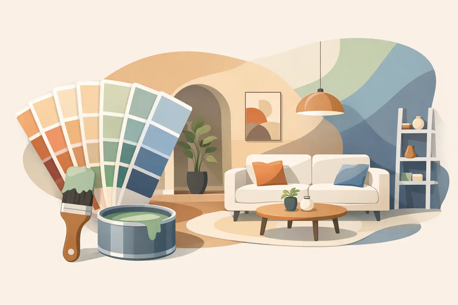
What interior house paint colours 2026 are moving towards
The big change is warmth. Not heavy, dark colours in every room, but softer and more natural tones that take the edge off bright whites and grey-heavy schemes. Clean white still has a place, especially on trims and ceilings, but full rooms in icy white are losing favour because they can feel hard and clinical, particularly in homes with strong afternoon sun.
Instead, the colour direction for 2026 is built around warm whites, clay-based neutrals, muted greens, soft stone shades and earthy taupes. These colours do a better job of making a space feel settled. They also tend to work well with timber floors, natural fibres, stone finishes and older Adelaide homes that already have some character in the bones of the property.
That does not mean bold colours disappear. Deep olive, moody blue-grey and richer terracotta accents are still around, but they are being used with more restraint. A full house in dark colour can close in quickly if the room does not have enough light. A feature wall, study nook, hallway or cabinetry update is often the better move.
The key colour families worth considering
Warm whites that do not feel sterile
Warm whites are likely to be the safest and most useful option for many homes in 2026. They keep rooms bright without the sharpness of cool white. In living areas, they help natural light feel softer. In bedrooms, they create a calmer look without making the room feel beige or dull.
This is especially useful in Adelaide homes where sunlight can be intense. A white with too much blue or grey in it can bounce light harshly and make walls feel colder than expected. A white with a gentle cream, stone or parchment base often sits better throughout the day.
Greige, taupe and soft stone neutrals
Neutral does not have to mean boring. The better neutral shades for 2026 have more depth than the plain builder-style greys that dominated for years. Think soft taupe, putty, mushroom and pale stone. These shades work well in open-plan spaces because they feel modern without being too stark.
They are also practical. In busy households, softer mid-tone neutrals tend to hide light scuffs and fingerprints better than very bright whites. For rentals and homes with kids or pets, that matters.
Muted greens with a natural feel
Green keeps holding its place, but the cleaner sage tones are shifting towards more grounded versions. Dusty olive, eucalyptus, moss and muted green-grey shades are showing up more often in bedrooms, studies and living rooms.
These colours suit people who want something more interesting than neutral, but not too loud. They also pair well with timber furniture, black hardware and off-white trims. In the right room, a soft green can make a space feel balanced and relaxed. In the wrong room, especially one with poor light, it can look muddy. That is one of those areas where sampling properly matters.
Earthy shades that add warmth
Terracotta, clay, dusty pink-beige and sand-based tones are becoming more common, particularly in feature areas. Used well, they bring warmth and personality without looking overdone. Used badly, they can date quickly.
The trick is restraint. These warmer earthy colours often work best in smaller doses – a dining room wall, a powder room, a hallway niche, or built-in cabinetry. They can be excellent for homes that feel too cold or plain, but they need to tie in with flooring, joinery and the amount of natural light in the room.
How Adelaide homes affect colour choice
Not every trend translates well once it hits a real property. That is where local experience counts. A colour that looks perfect in a showroom or on a phone screen can read completely differently in an Adelaide villa, unit or newer build.
North-facing rooms tend to hold warmth well, so some colours look creamier or brighter there. South-facing spaces can flatten certain shades and make cool undertones stronger. Open-plan homes often need colours that carry well from one area to the next, while older homes with separate rooms can handle a bit more contrast.
Ceiling height, flooring, window size and existing trim all change how paint reads. So does the finish. A matte wall finish may soften a colour, while low-sheen or washable finishes can reflect more light and bring out undertones. If the walls have dents, patching issues or previous repairs, the preparation matters just as much as the colour itself. Even the best shade will not look right on a rough surface.
Best paint colours for different rooms in 2026
Living areas
Living rooms are leaning towards warm white, soft greige and light stone. These shades keep the room open and flexible, especially if furniture, rugs and artwork will do most of the talking. If you want more depth, a muted olive or deeper neutral on a single wall can work, but only if the room has enough natural light.
Bedrooms
Bedrooms suit softer, quieter shades. Muted green, warm beige, dusty stone and off-white all work well because they feel restful. Very bright white can feel too hard at night, especially under artificial lighting. Darker colours can look great in a main bedroom, but they need to be chosen carefully so the room still feels comfortable rather than boxed in.
Kitchens and dining areas
Kitchens still favour light colours because they keep the space clean and fresh, but warmer whites and pale neutral tones now feel more current than cool grey-based shades. If cabinetry is being refinished, this is where earthy greens, deeper greige or muted mushroom tones can create a more updated look without going too bold.
Hallways and rental properties
For hallways, entry areas and rentals, practicality leads the decision. Mid-light neutrals that are easy to maintain usually win. You want a colour that looks clean, works with different furnishings and does not date quickly between tenancies. This is not always the place to experiment.
Trendy versus durable – getting the balance right
A paint job is not something most people want to redo every year or two. That is why chasing trends too hard can be costly. The better approach is to use trend-driven colours where they are easy to live with or easier to change later, while keeping the main body of the home more timeless.
For example, a warm neutral through the main areas gives you flexibility. Then you can bring in stronger colour in a study, bedroom, feature wall or cabinetry. That gives the house personality without locking the whole property into a very specific look.
This matters even more for landlords, agents and anyone painting before sale. Broad appeal usually beats personal taste. A well-chosen warm neutral with proper prep and a clean finish will do more for presentation than a risky colour picked off a trend board.
The finish matters as much as the shade
People often focus on colour and forget the condition of the walls, the quality of the prep and the finish selected for the room. That is where the result is often won or lost. If there are cracks, patched areas, peeling paint or surface damage, these need to be handled properly before painting starts.
A beautiful 2026 colour will still look second-rate on poorly prepared walls. The same goes for using the wrong finish in a high-traffic area. Family homes, rentals and commercial interiors need coatings that can handle cleaning and daily use. That is one reason many property owners prefer working with painters who handle repairs, preparation and repainting as one proper job rather than trying to patch it together.
If you are not sure where to start, keep it simple. Choose colours that suit your light, your flooring and how the room is used. Sample them on the actual wall, not just on a tiny card. Look at them in morning light, afternoon light and with lamps on. And if the goal is a finish you will still be happy with after the excitement of a new trend wears off, back warmth, balance and good preparation every time.
The best interior colour for 2026 is not the one getting the most attention online. It is the one that makes your space feel right the minute you walk in and still looks the part after real life gets back underway.