You can spot an outdated interior the moment the light hits the walls. A colour that looked fine ten years ago can suddenly make a room feel flat, dark or harder to style. If you’re wondering what interior house paint colours are trending, the short answer is this: homes are moving towards warmer, softer and more lived-in colours that still feel clean and practical.
That shift matters because paint is not just about fashion. The right interior colour can make a small room feel more open, help a rental present better, soften harsh natural light, and give a home a finish that feels current without needing a full renovation. Trends are useful, but the best result comes from knowing which ones actually suit the way your property is built, lit and used.
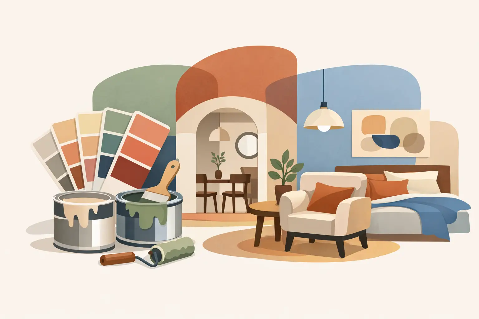
What interior house paint colours are trending right now?
The biggest change has been the move away from cold, stark whites and blue-based greys. People still want fresh interiors, but they want them to feel warmer and easier to live with. That is why soft whites, warm neutrals, muted greens and earthy feature tones are leading the way.
In Adelaide homes, this trend works particularly well because light levels can be strong and unforgiving. A bright white that looks crisp on a paint card can feel clinical on a full wall once the afternoon sun hits it. Warmer paint colours tend to sit better across different times of day and give rooms a more settled look.
Warm whites are replacing harsh whites
Warm whites remain one of the safest and most popular choices, but the preference has clearly shifted. Instead of sharp whites with cool undertones, more homeowners are choosing whites with a touch of cream, beige or soft grey underneath. These colours still keep a room bright, but they do not feel sterile.
They suit open-plan living areas, hallways and bedrooms because they pair well with timber flooring, stone finishes, black fixtures and natural textures. They are also practical for resale and rental properties, where a broadly appealing finish matters. The trade-off is that some warm whites can look too yellow in certain lighting, so testing on the actual wall is always worth doing.
Greige and taupe are still strong
Greige, which sits between grey and beige, has stayed popular because it solves a common problem. It gives you the clean, modern feel people liked in grey interiors, but without the coldness that made many homes feel lifeless. Taupe works in a similar way, adding more depth and softness than plain off-white.
These shades are especially useful in living rooms, entryways and homes with a lot of hard finishes such as tiles, metal and stone. They help balance modern interiors and make spaces feel more finished. If you go too dark, though, they can flatten a smaller room, so the exact tone needs to suit the size and natural light of the space.
Muted greens have become a favourite
Soft sage, olive-grey and dusty green tones are now some of the most requested interior colours. They bring in a natural feel without being loud, and they work well in both older character homes and newer builds. Used properly, green feels calm, grounded and current.
Bedrooms, living rooms and even cabinetry are where these colours tend to shine. A muted green can add personality while still staying easy to furnish around. The key is restraint. A soft green across all four walls can look excellent in one room, while in another it may work better as a feature colour paired with a warm neutral.
Earthy tones are coming back in a cleaner way
Terracotta, clay, mushroom and dusty sand tones are making a comeback, but not in the heavy way people might remember from older decorating styles. Today these colours are more muted and more refined. They are being used to add warmth and character, especially in homes where people want something more inviting than white walls throughout.
These shades often work best in dining areas, sitting rooms, studies and feature walls. They can look outstanding with timber joinery and textured furnishings. The catch is that earthy colours are more sensitive to light and surrounding finishes. What feels warm and rich in one room can feel muddy in another.
Dark feature colours are being used more carefully
Deep charcoal, navy, forest green and rich brown are still in the mix, but they are no longer being thrown into every room as a default feature wall. People are using darker colours with more purpose – on cabinetry, in powder rooms, behind shelving, or in spaces where a moodier finish makes sense.
When dark paint is used well, it can look high-end and dramatic. When it is used badly, it can make a room feel smaller and date quickly. Preparation and finish matter here too. Dark colours tend to show surface flaws more readily, so patched walls, sanding and proper undercoating become even more important.
Why trends look different from one house to another
A paint trend is never one-size-fits-all. The same colour can look completely different depending on the age of the home, ceiling height, window direction and the surfaces around it. That is why choosing from a trend list alone rarely gives the best result.
In older Adelaide homes, warmer whites and soft greens often sit nicely with decorative cornices, timber floors and period details. In newer homes, greige and muted earth tones can take the edge off large open-plan spaces that might otherwise feel too stark. Rentals are another category again. In those properties, broad appeal and durability usually matter more than making a bold statement.
This is where practical colour advice makes a real difference. A trending shade might look great online, but if it fights with your flooring or makes patched walls stand out, it is not the right colour for the job.
How to choose a trending colour without regretting it
Start with the fixed elements you are not changing. Flooring, benchtops, splashbacks, tiles and cabinetry all affect how a wall colour will read. If those finishes are warm, a cool paint can feel out of place. If they are cool, some warmer neutrals may look too creamy.
Next, look at the light. North-facing rooms generally handle warmer shades well, while south-facing rooms can make cool colours feel even colder. Strong natural light can wash out pale colours, while darker rooms often need something with a bit more body to avoid looking dull.
Then think about how the room is used. Bedrooms usually suit softer, calmer tones. Busy family areas need colours that still look tidy under everyday wear. Rental properties benefit from shades that are easy to maintain and broadly appealing to incoming tenants.
Most importantly, test before committing. Paint a decent sample area on more than one wall and check it in morning, afternoon and evening light. That simple step prevents a lot of expensive mistakes.
Finish matters as much as colour
A trending colour will only look good if the surface underneath is properly prepared and the finish suits the room. Marks, dents, peeling areas and rough patches can ruin the final result, especially with darker tones or low-sheen paints that catch the light differently.
For living rooms and bedrooms, low sheen often gives a smart, modern finish. Kitchens, laundries and high-traffic areas may need something more washable and hard-wearing. If walls need repairs first, that work should never be rushed. Good painting is not just about the top coat. It is about the prep, the product choice and the way the whole room comes together.
The safest trend is one that still suits your property in five years
Not every trend is worth chasing. If you are painting to live in the home long term, it makes sense to choose colours that feel current but still have staying power. Warm whites, balanced neutrals and muted natural tones tend to do that well. They give you a fresh, updated look without boxing you into a short-lived style.
If you are painting for sale or lease, restraint usually wins. A clean, warm, well-finished interior appeals to more people than a series of risky colour choices. That does not mean every room has to be plain. It just means the colour plan should work for the property, not against it.
At Shine Painters Adelaide, that is usually the difference between a paint job that simply changes colour and one that genuinely lifts the whole home. A good trend should make your place look better, feel better and hold up properly once real life starts happening in it.
If you are choosing interior colours now, lean toward warmth, softness and practicality. The best trending shade is the one that still looks right after the furniture goes back in, the light changes, and the room gets used every day.