
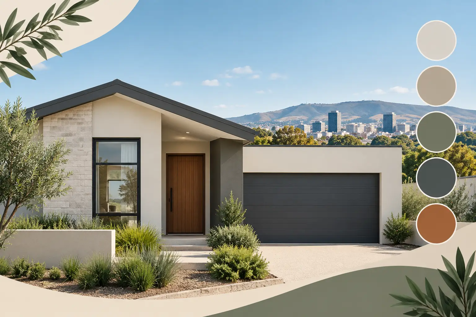
A fresh exterior should still look good after a few Adelaide summers, not only on the day the painter packs up. That is the useful lens for looking at exterior facade colour trends 2026. The strongest looks are less about chasing a bold new shade and more about choosing colours that suit the home, hold up in hard light and work with the materials already on site.
For homeowners, landlords and commercial property owners, the right exterior colour can lift street appeal, make maintenance marks less obvious and give a tired building a properly finished look. But colour is only one part of the result. Surface preparation, repairs and using the right coating system matter just as much.
Exterior facade colour trends 2026: grounded, not flashy
The main shift for 2026 is towards warmer, more settled colour schemes. Crisp blue-grey exteriors and bright white trim are giving way to shades with a little more depth: earthy neutrals, softened whites, natural greens and darker accents used with restraint.
This works particularly well in Adelaide, where strong sun can make pale cool colours look harsh and where dust, dry conditions and weather exposure need practical consideration. A colour that looks subtle on a sample card may read much brighter over a full rendered wall. Viewing samples outside, at different times of day, is worth the effort before committing.
The aim is not to make every property look the same. A 1920s bungalow, a contemporary two-storey home, a brick unit and a commercial frontage each need a different approach. Good colour selection respects the building rather than fighting it.
Warm off-whites replace stark white
Clean white will always have a place, especially on trim, eaves and newer architectural homes. In 2026, though, warmer off-whites are doing more of the work on main exterior walls. Think creamy whites, soft stone, light biscuit and subtle mushroom tones rather than a cold, brilliant white.
These colours can make render look smoother and more welcoming. They also sit comfortably alongside timber, terracotta tiles, sandstone details and aged brickwork common across Adelaide suburbs. The trade-off is that very light finishes can show grime around downpipes, entry points and low walls, so a quality washable exterior coating and regular cleaning help keep the finish looking sharp.
Earthy neutrals give homes lasting appeal
Taupe, putty, warm greige, clay and sand-based neutrals are among the safest choices for a full repaint. They are flexible enough to work with charcoal roofing, black window frames, timber features and established gardens without looking dated quickly.
For rental properties, these tones are particularly practical. They appeal to a broad range of tenants and buyers, photograph well and are easier to touch up than a highly distinctive feature colour. A slightly deeper neutral on lower walls, fencing or a garage door can also hide everyday marks better than a very pale shade.
Neutral does not have to mean flat. The difference between a tired beige and a considered warm grey often comes down to the undertone. Some colours pull pink in afternoon light, while others turn green or yellow next to existing brick. This is why colour choices should be checked against the roof, paving, gutters and fixed finishes before paint is ordered.
Natural greens and muted blues
Soft eucalyptus, olive, sage and grey-green are becoming more common on weatherboards, front doors, gables and exterior cladding. These shades suit homes with gardens, timber elements or a more relaxed coastal and hills feel. They offer colour without shouting across the street.
Muted blue-greys can still work, but the trend is moving away from icy tones. A blue with a green, grey or smoky base is usually easier on the eye in Adelaide sunlight. On a large facade, the safest route is often to keep the main walls neutral and use green or blue on a smaller architectural area, such as a front door, porch ceiling or feature cladding.
Darker colours absorb more heat, which matters on exposed walls, metal cladding and garage doors. They can look excellent, but they need the right paint product and a sound surface underneath. On some substrates, particularly older render or lightweight cladding, a very dark change from the existing colour may not be suitable. A professional assessment avoids problems later.
Charcoal is now an accent, not the whole house
Charcoal, black and deep bronze are still popular, especially with modern window frames and Colorbond roofing. The difference in 2026 is how they are being used. Rather than coating every wall in near-black, homeowners are using dark shades to frame lighter facades: on fascia boards, doors, gates, shutters, fencing or selected cladding panels.
This creates contrast without making the property feel heavy. It also helps retain detail. Deep colours can swallow architectural features when used across a large flat elevation, particularly on a home that does not get much shade.
For commercial premises, a dark trim paired with a warm neutral wall can look polished and professional. It is often a better long-term choice than a full dark facade, which can reveal fading, dust and scuffing more readily in busy areas.
Let the existing materials lead the palette
A repaint does not remove the roof tiles, paving, brickwork, stonework or aluminium window frames. Those elements should lead the colour direction. Trying to force a fashionable shade against a strong red brick or warm terracotta roof rarely gives the clean result owners are hoping for.
Painted brick is one option where the brick is mismatched, badly stained or simply past its best, but it is a more permanent decision than repainting render. Brick needs proper cleaning, appropriate primers where required and a breathable coating system suited to masonry. Skipping those steps can lead to peeling paint or trapped moisture issues.
The same applies to render. Small cracks and hollow or damaged sections should be repaired before painting, not covered over and hoped for the best. Paint can transform the appearance of a facade, but it cannot fix failed substrate underneath it.
How to choose a colour that works beyond 2026
Trends are useful as a starting point, not a rulebook. The right choice depends on your property style, its orientation, the amount of direct sun, neighbouring homes and how long you plan to keep the finish.
Start by narrowing the scheme to three parts: the main wall colour, the trim colour and one accent colour. Too many competing shades can make a facade look busy. On many homes, a warm neutral wall, an off-white trim and a darker front door or metal detail is all that is needed.
Then test larger samples than a small colour card. Paint sample boards and place them against the facade near the roofline, paving and existing brick. Look at them in morning light, full sun and late afternoon shade. What seems like a gentle warm white in a showroom can look almost cream outdoors, while a soft charcoal may appear black by midday.
If the property is being prepared for sale or lease, lean towards broad appeal. A well-finished neutral scheme usually adds more value than a colour that only suits one person’s taste. If it is your long-term home, there is more room to use a stronger front door or feature section that feels personal.
A durable finish starts before the first coat
The best exterior facade colour trends for 2026 will not help if the paint is applied over chalky render, cracked timber, flaking old coatings or unprepared metal. Exterior painting should begin with washing down, removing loose material, treating problem areas, repairing damage and priming surfaces where needed.
Different surfaces need different systems. Timber may need filling, sanding and sealing. Metal and aluminium require careful cleaning and suitable primers for adhesion. Render and masonry need coatings that allow the surface to perform properly. These are not shortcuts worth taking, particularly when Adelaide heat and weather can quickly expose poor preparation.
At Shine Painters Adelaide, the focus is on doing the preparation and repairs properly before the final coats go on. That means the new colour is backed by a finish designed to last, not just a quick cosmetic change.
A considered colour scheme should make your property feel more like itself. Choose a shade that works with the building, test it in real daylight and give the preparation the same attention as the paint colour. That is how a 2026 update stays looking good well after the trend has moved on.